Autism Warning!
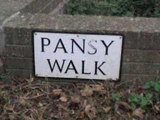
Right. So one of my obsessive "must find out" things of the past couple of weeks is the design of street signs in Edinburgh (and in fact many other places in Britain). Mostly, I wanted to find out what font the black-on-white serifed capitals were. For some reason, I like subtle designs with preferably serif capitals.
Most of the street signs in Edinburgh look like this:
It turns out that the font was custom designed as part of the whole street sign design by David Kindersley (1915-1995), a (mostly) Cambridge-based stonecutter and type designer. The stone-cutting background is one of those things that you don't know, but doesn't surprise you when you find out. (A similar design is the font Trajan, which was based on carved inscriptions on Trajan's Column in Rome.)
I particularly like the R:
Whenever you try looking anything up on the internet, you learn a whole lot more than you originally intended. First, Kindersley was an apprentice of Eric Gill (of Gill Sans fame), who in turn was taught by Andrew Johnston (who designed the font for the London Underground).
And now that we're in London, there's a particularly famous street sign design there too:
Apparently only in Westminster, but there's a fair number of famous streets in that part of town – not so much Hop Gardens, but streets like Abbey Road, Downing Street, and Baker Street (with complimentary Sherlock Holmes silhouette in the top right of the street sign). The Westminster street signs are so iconic that the borough have now obtained all copyright to the design and are ready and willing to enforce it...
(Univers Condensed Bold, by Adrian Frutiger, by the way; the signs were designed by Sir Misha Black (1910-1977).)
A bit closer to (my brother's) home: street signs in Amsterdam, more well-done public typeface designing. Amsterdam street signs feature the sans-serif font described in the national norm NEN 3225:1962, which designer Sem Hartz had some influence on apparently. (This design is common throughout the Netherlands, apart from the district indication, although it's now being replaced by Gerard Unger's ANWB-Uu.) (Also, public typeface design by committee, where have we heard that before?)
For more on Amsterdam street signs, this is nice.
Question
Is it necessary to include an indication of the town district on street signs? I suppose it does have a certain je ne sais quoi, but it's probably completely redundant information. Most people will know where approximately they are. But then, street signs are probably for people that don't know where they are. For those people, some extra information could be useful. But should the information then take the form of a borough/district name (which would be meaningful to people) or a postcode (which, well, would not really...)?
CLUNY GARDENSor
EH10
CLUNY GARDENSWhich is better?
Morningside

No comments:
Post a Comment