11 July 2008

Tu/vous distinction

The tu/vous distinction is very salient in Dutch. Younger people are probably more inclined to say 'je' (tu) to more people than older people, and of course that's a reason that the language and the country are both going to the dogs. Not like in the polite good ol' days, anyway. This means that any choices for 'je' or 'u' (vous) in the media are very important, and most interviews begin with some metalinguistic comment about choosing 'je' "because we've known each other for quite some time".

This morning VPRO's Marathon Interview with Marjolijn Februarie started with the question

"Heeft u liever dat ik 'je' zeg of heb je liever dat ik 'u' zeg?"
A nice and balanced way around the problem.

She chose 'je', by the way.
10 July 2008

These boots are made for verbin'

Now, if the average 18-year-old wouldn't find Nancy Sinatra the antithesis of cool, here would be an awesome way to illustrate the concept of word-formation through noun-to-verb and adjective-to-verb conversion:

You keep lying, when you oughta be truthin'
and you keep losin' when you oughta not bet.
You keep samin' when you oughta be changin'.
Now what's right is right, but you ain't been right yet.
Truthin' is not actually Nancy Sinatra's fault. The verb truth (well, treuþen) was attested before 1300, says the OED (subscription needed). Since 1300, we've had four meanings that are now obsolete, and we're on to meaning 5, 'to bring to truth, adjust accurately', with the only example from 1881. Nancy does not seem to be saying "You keep lying, when you ought to be setting things right" though, but rather "when you ought to be telling the truth". Meaning 6.

Samin' is not attested in the OED as a verb. This one is also quirky semantically. Most adjective-to-verb conversions are semantically to do with becoming whatever the adjective is. "The new lands begin to green with vineyards" or "The white frock which she had so carelessly greened on the damping grass" (see also meaning 5 in the OED for truth). But this one is not about becoming the same in an inspired bout of Gleichschaltung, it's about staying the same.

Nancy Sinatra would be a welcome change from the ever-present Jabberwocky, though...

Not to be confused

Restoration: eat that, Cromwell!
Restauration: eat that, Cromwell!

Not a typo you want to make in your PhD.

05 July 2008

Street signs

Autism Warning!

Right. So one of my obsessive "must find out" things of the past couple of weeks is the design of street signs in Edinburgh (and in fact many other places in Britain). Mostly, I wanted to find out what font the black-on-white serifed capitals were. For some reason, I like subtle designs with preferably serif capitals.

Most of the street signs in Edinburgh look like this:


It turns out that the font was custom designed as part of the whole street sign design by David Kindersley (1915-1995), a (mostly) Cambridge-based stonecutter and type designer. The stone-cutting background is one of those things that you don't know, but doesn't surprise you when you find out. (A similar design is the font Trajan, which was based on carved inscriptions on Trajan's Column in Rome.)

I particularly like the R:


Whenever you try looking anything up on the internet, you learn a whole lot more than you originally intended. First, Kindersley was an apprentice of Eric Gill (of Gill Sans fame), who in turn was taught by Andrew Johnston (who designed the font for the London Underground).

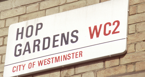
And now that we're in London, there's a particularly famous street sign design there too:


Apparently only in Westminster, but there's a fair number of famous streets in that part of town – not so much Hop Gardens, but streets like Abbey Road, Downing Street, and Baker Street (with complimentary Sherlock Holmes silhouette in the top right of the street sign). The Westminster street signs are so iconic that the borough have now obtained all copyright to the design and are ready and willing to enforce it...

(Univers Condensed Bold, by Adrian Frutiger, by the way; the signs were designed by Sir Misha Black (1910-1977).)

A bit closer to (my brother's) home: street signs in Amsterdam, more well-done public typeface designing. Amsterdam street signs feature the sans-serif font described in the national norm NEN 3225:1962, which designer Sem Hartz had some influence on apparently. (This design is common throughout the Netherlands, apart from the district indication, although it's now being replaced by Gerard Unger's ANWB-Uu.) (Also, public typeface design by committee, where have we heard that before?)


For more on Amsterdam street signs, this is nice.

Question
Is it necessary to include an indication of the town district on street signs? I suppose it does have a certain je ne sais quoi, but it's probably completely redundant information. Most people will know where approximately they are. But then, street signs are probably for people that don't know where they are. For those people, some extra information could be useful. But should the information then take the form of a borough/district name (which would be meaningful to people) or a postcode (which, well, would not really...)?

CLUNY GARDENS
EH10
or
CLUNY GARDENS
Morningside
Which is better?